


Fleur de Lune: A bejewelled illustration and its conservation framing
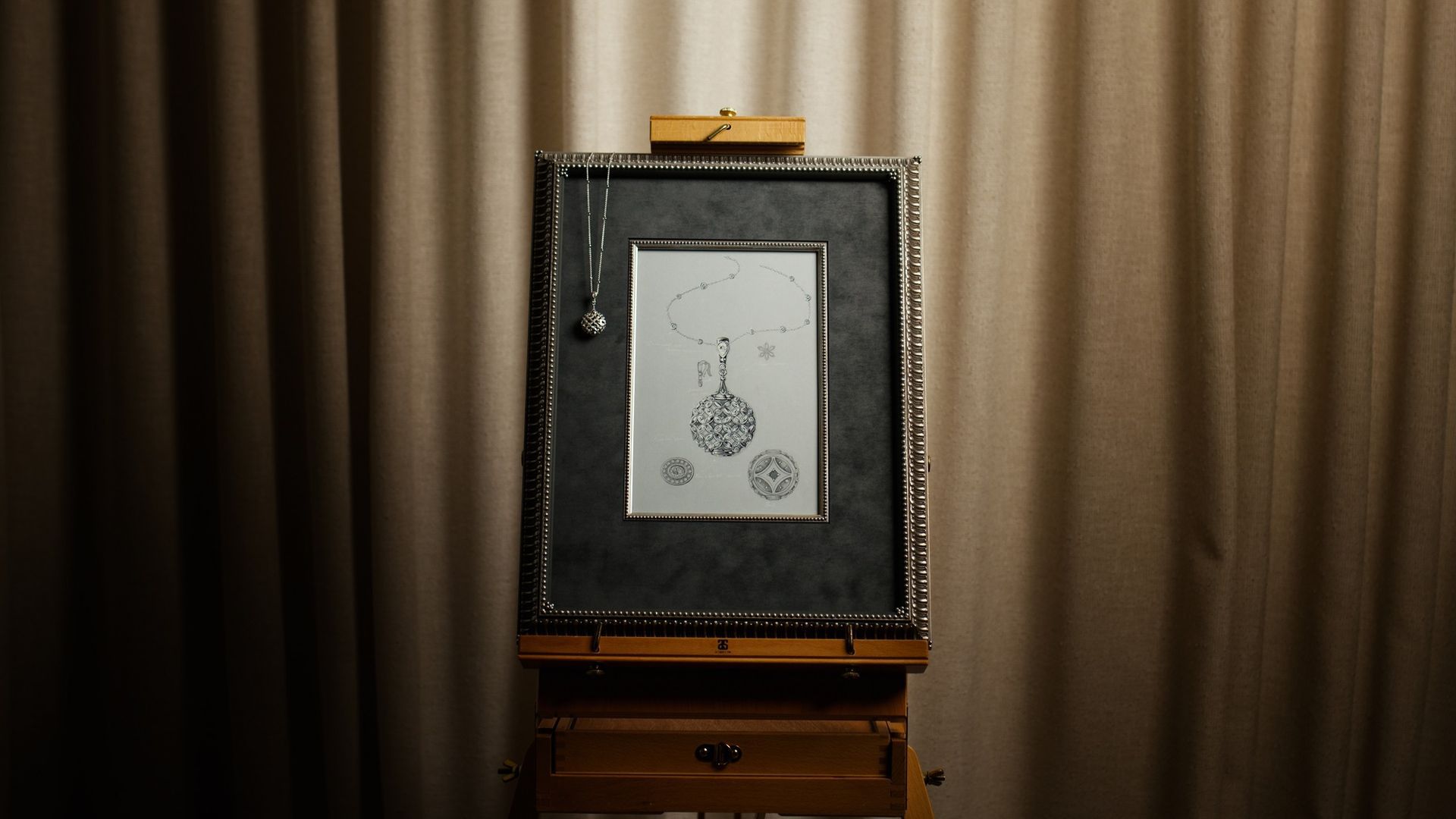
Sometimes a piece of art becomes more than something beautiful — it becomes a way to honour and serve our community. That spirit sits at the heart of ARTSHOP's annual collaboration with Hogans Family Jewellers for the Toowoomba LifeFlight Gala: a three‑part expression of artisan craft that brings together the design of an heirloom jewel, the illustration of that real‑world piece, and the conservation framing that presents and preserves the artwork — all donated to help raise vital funds for LifeFlight's work across the Darling Downs. Watching these stages come together each year, from the first sketch to the framed final piece, is one of the genuine privileges of our work.
There is always much anticipation amongst the ARTSHOP team when we first get a sense of what award-winning jeweller Keelie Skou has created for the Balloon Pop — one of the Gala’s most anticipated philanthropic moments. This year’s piece, Fleur de Lune, continues that tradition, and it’s no surprise that the Balloon Pop raised an extraordinary amount — we’ll share the figure at the end of this story.
After this year’s Gala, we spoke with Keelie to talk through how Fleur de Lune came together — the design thinking behind the jewellery, the discipline behind the illustration she completed once the piece itself was finished, and what it has meant for us, on the framing side, to be entrusted with the work each year. What follows is the story as she generously told it to us, woven with our own perspective on receiving and preserving her work.
Inspired by light: interpreting the Gala’s ‘Mirror Ball’ theme
We always ask Keelie where a new piece begins, and this year the brief came from the Gala itself. “The theme for the 2026 LifeFlight Gala was ‘Mirror Ball’,” Keelie told us, “and from the very beginning, we wanted to create a piece that reflected the theme beautifully while remaining timeless and wearable.” The name Fleur de Lune — which translates from French to English as “moonflower” or “flower of the moon,” a nocturnal bloom that opens only at night — guided the aesthetic. “The name evokes elegance and softness, while also tying back to the moon’s natural ability to reflect light,” she explained.
What struck us most was how much intention sat behind the spaces between the diamonds, not just the stones themselves. “A key focus within the design was ensuring that not only the diamonds sparkled, but that every element of negative space felt considered,” Keelie explained. “The spacing between the marquise diamonds subtly forms delicate four‑pointed star shapes, creating hidden moments of symbolism within the piece.” That celestial thread continues on the reverse, where a star motif adds, in her words, a sense of sophistication.
A palette chosen for brilliance and meaning
The gemstones and metals carried the same level of intention. “We wanted to create a piece that felt feminine, elegant, and highly-wearable without overtly resembling a disco ball,” Keelie told us. “Every element was thoughtfully considered throughout the design process.” Marquise diamonds sit at the centre of that intention, creating what she describes as delicate faceted moonflower floral motifs that continue throughout the pendant, reflecting and dispersing light from every angle. A pear‑cut diamond crowns the bale, with marquise, round brilliant and oval diamonds completing the composition: 1.56ct of natural white diamonds in total.
The piece is crafted in 18k white gold, chosen, Keelie says, to enhance brilliance and ensure longevity. “By combining timeless natural diamonds with a precious metal of enduring quality, the intention was to create not only a statement piece for the evening, but a future heirloom” — a sentiment that resonates strongly with us at ARTSHOP, as the piece then moves from jewel to illustration, and finally into the frame we design and build to preserve this moment in time for its future custodians.
Craftsmanship and the precision behind the pieces
Behind the elegance lies a highly technical process, and Keelie was candid about how exacting this needs to be. “With high‑end bespoke jewellery, no stage of the process from the initial concept through to the final polish can ever be overlooked.” Fleur de Lune's design demanded close attention because of its “intricate balance of negative space, diamond placement, and multi-directional light performance” — even the smallest variation would have affected the symmetry and flow of the piece. Maintaining structural integrity while preserving delicacy also required careful engineering.
It’s a piece that took a full team at Hogan’s to bring to life. Keelie began with the initial design and sketch, which Nolan translated into CAD files; Tim then undertook the manufacturing and assembly, Leo set each diamond meticulously, and Tim completed the final polish.
That’s the point at which our part of the story begins. Once the jewel was complete, Keelie turned to the bespoke illustration that would eventually come to us at ARTSHOP.
The illustration: discipline, storytelling and artisan detail
“Jewellery illustration is a meticulous process,” Keelie told us, “particularly when the intention is to accurately represent a finished bespoke piece in terms of scale, proportion, colour, and gemstone detail.” She prefers to wait until the jewellery itself is finished before she begins, which she says enables “accuracy in capturing the final form, light performance, and intricate detailing as it exists”, and the chance to observe how the design truly comes to life once crafted.
For Keelie, the illustration is never just a record of what was made. “It becomes more than documentation,” she told us. “It is a visual storytelling process that honours the craftsmanship, emotion, and individuality embedded within the piece.” It’s precisely why ARTSHOP treats the framing of her work with the same level of care she brings to creating it, because a piece built with that much intention deserves a presentation to match, which is where our own work begins.
Conservation framing: preserving the heirloom’s aesthetic for generations
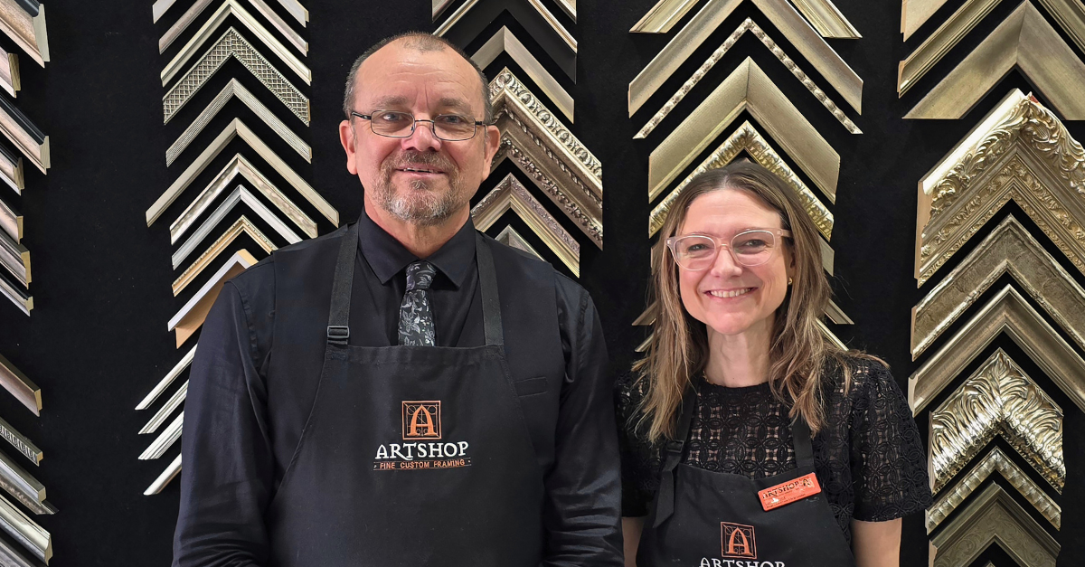
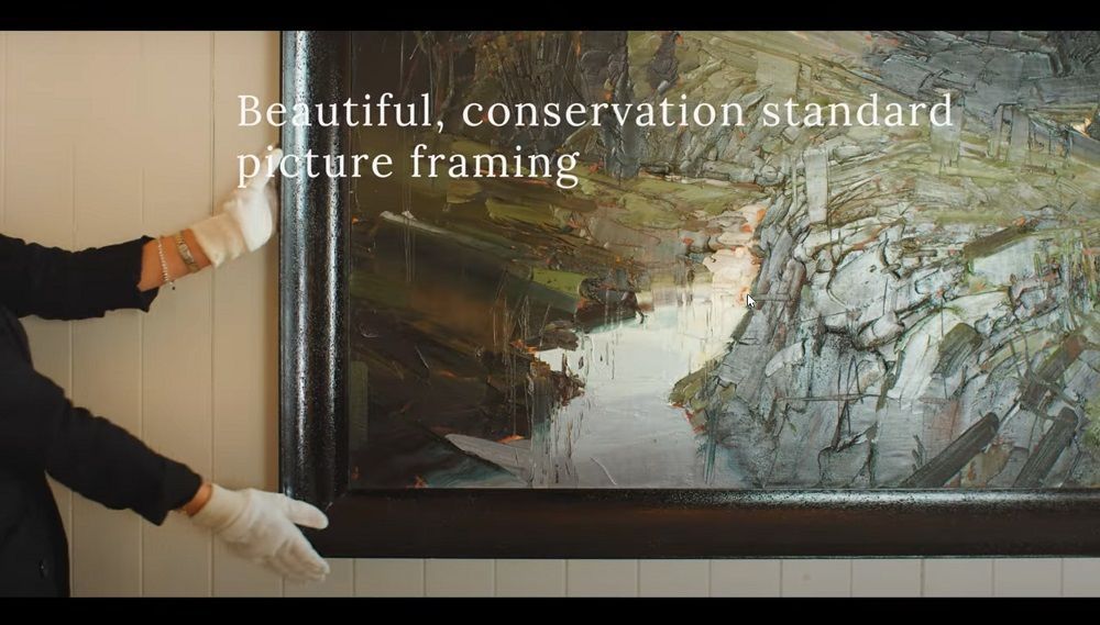
Once Keelie’s illustration is complete, it becomes our job at ARTSHOP to preserve and present it through conservation‑grade framing — and we feel that responsibility deeply. As ARTSHOP’s owner and director, Cherylyn Russell explains, the first principle is always preservation. “ARTSHOP’s custom framing design ethos is to firstly preserve the piece — that is, facilitate artwork treatment if necessary and subsequently design a framing solution that is an archivally sound storage unit.” As she often puts it, “The principles of conservation framing are summarised thus: ‘to keep from harm, decay or loss’. That means the artwork must retain its complete integrity.”
From there, the framing becomes an aesthetic conversation with the artwork itself. “Aesthetically, we seek to extend the aesthetic elements of the artwork or object with its framing, so that the framing is a visual extension of the artwork,” Cherylyn says — a sentiment that aligns naturally with Keelie’s own approach to jewellery and illustration.
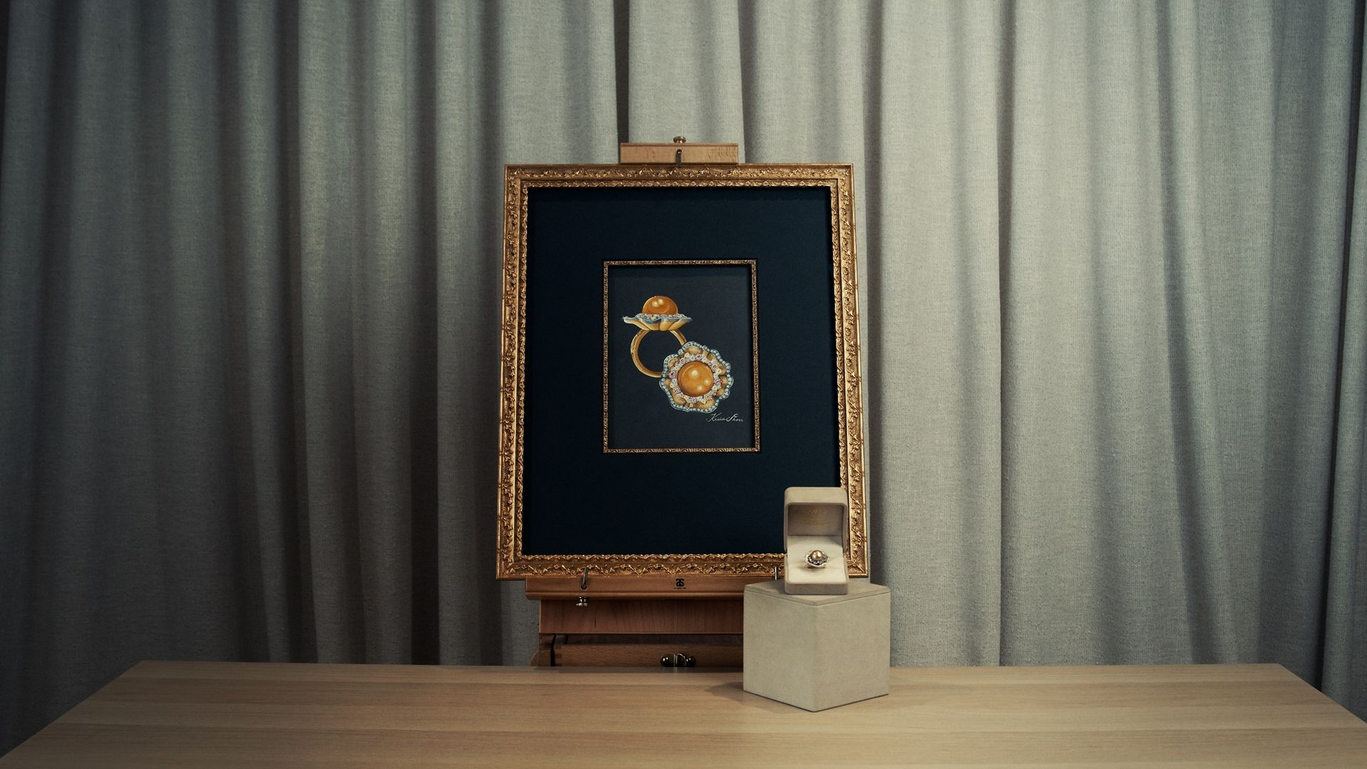
The Fleur de Lune illustration arrived with a subdued, antique styling that immediately shaped the design direction. “Keely is clever; she could have represented this jewel in plenty of different ways, but her instinct to lean into a vintage, almost architectural‑simplicity style for the illustration was inspired,” Cherylyn says. That instinct guided the framing conversation from the outset. “The Fleur de Lune illustration spoke to us about its framing!” she recalls. Together, she, Lucinda and Evan discussed their goals: “preserve the work, beautify the work with materials, forms and colours that extend the artwork and do not compete with it, and also use this opportunity to demonstrate our skills.”
Aesthetic and conservation considerations sit side‑by‑side in this process. As Cherylyn notes, “Long‑term conservation considerations do not need to compete. Conservation‑standard materials are readily available; the diversity of colours, finishes, textures are quite limitless!” The skill lies in knowing how to use them responsibly — reversible mounting, pH‑neutral materials, UV‑filtering glazing, and strong, spacious construction that stabilises and protects the artwork over time.
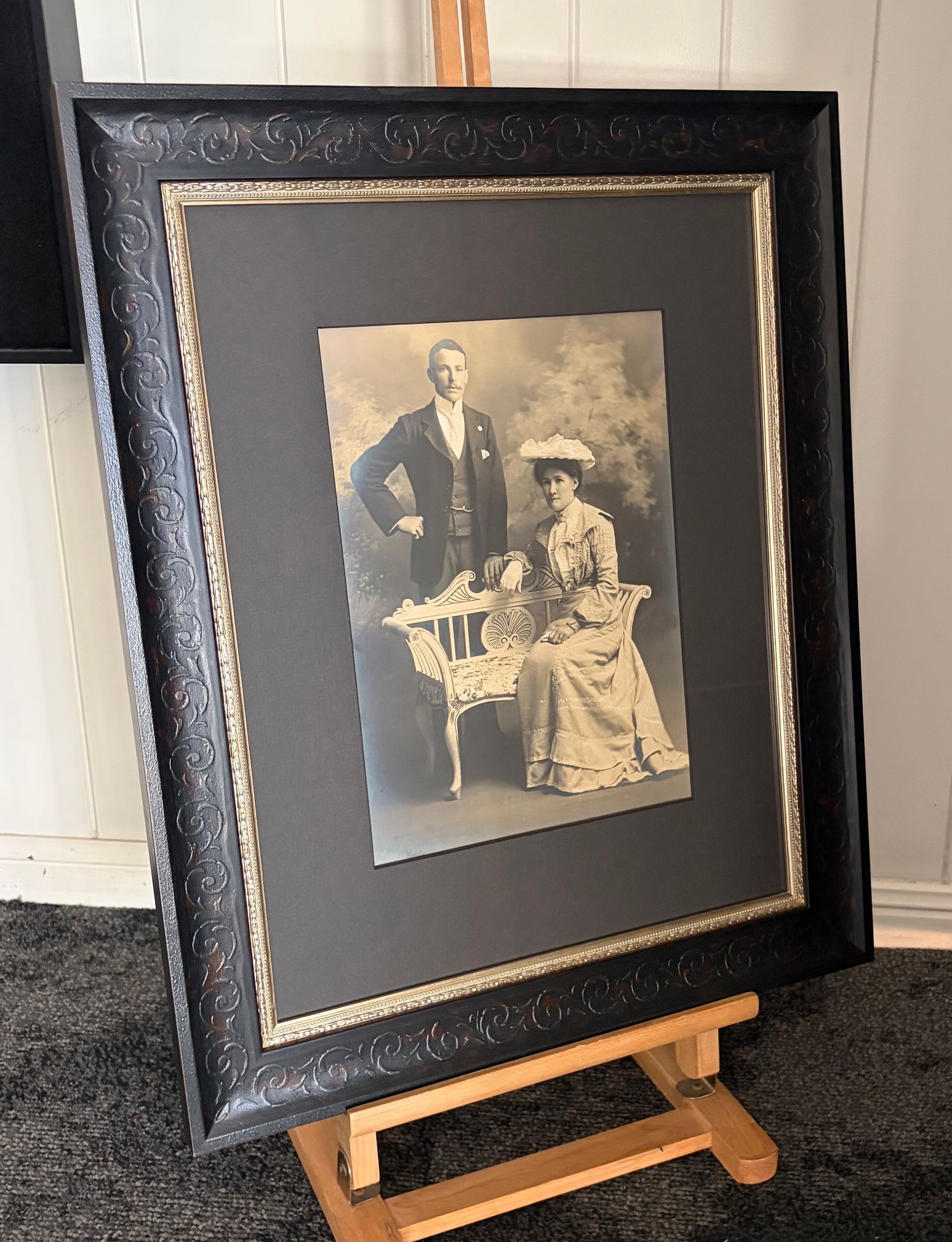
For Fleur de Lune, the team developed an aesthetic palette that echoed the illustration’s vintage sensibility: Italian warm silver‑leaf Deco‑era moulding, pH‑neutral warm pewter suede matting, and generous proportions. As the piece took shape, some details emerged instinctively. “It’s great when an artwork is just so pretty, so intact in its aesthetic. It simply asks, ‘just make me more like me!’” Cherylyn says. This palette creates a soft, lustrous edge that nods to the white gold and diamonds of the mirror‑ball‑inspired piece within, while a luxurious suede mat lends the presentation depth and refined opulence. The artwork sits within two frames rather than one — a substantial outer frame paired with a finer inner frame formed from antique silver beads sourced from Range Antiques — each adding its own sense of balance, weight and presence to the finished work. Cherylyn also added hand‑colouring to the background of the outer frame moulding to subtly increase contrast. “Knowing how to use these materials to enhance an artwork is the role of a skilled designer; knowing how to use the materials responsibly to preserve the artwork is the role of a skilled maker.”
The construction was equally considered — elevated matting to ensure the artwork never touches the glazing, an invisible channel spacer for ventilation, UV‑filtering, zero‑reflection glazing, and archival hinges that allow safe future removal. These decisions reflect ARTSHOP’s conservation priorities: to protect the illustration for decades to come, and reversable if needed.
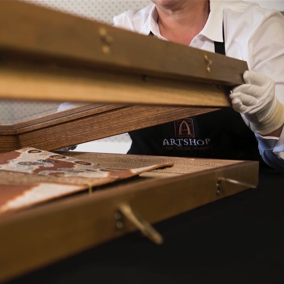
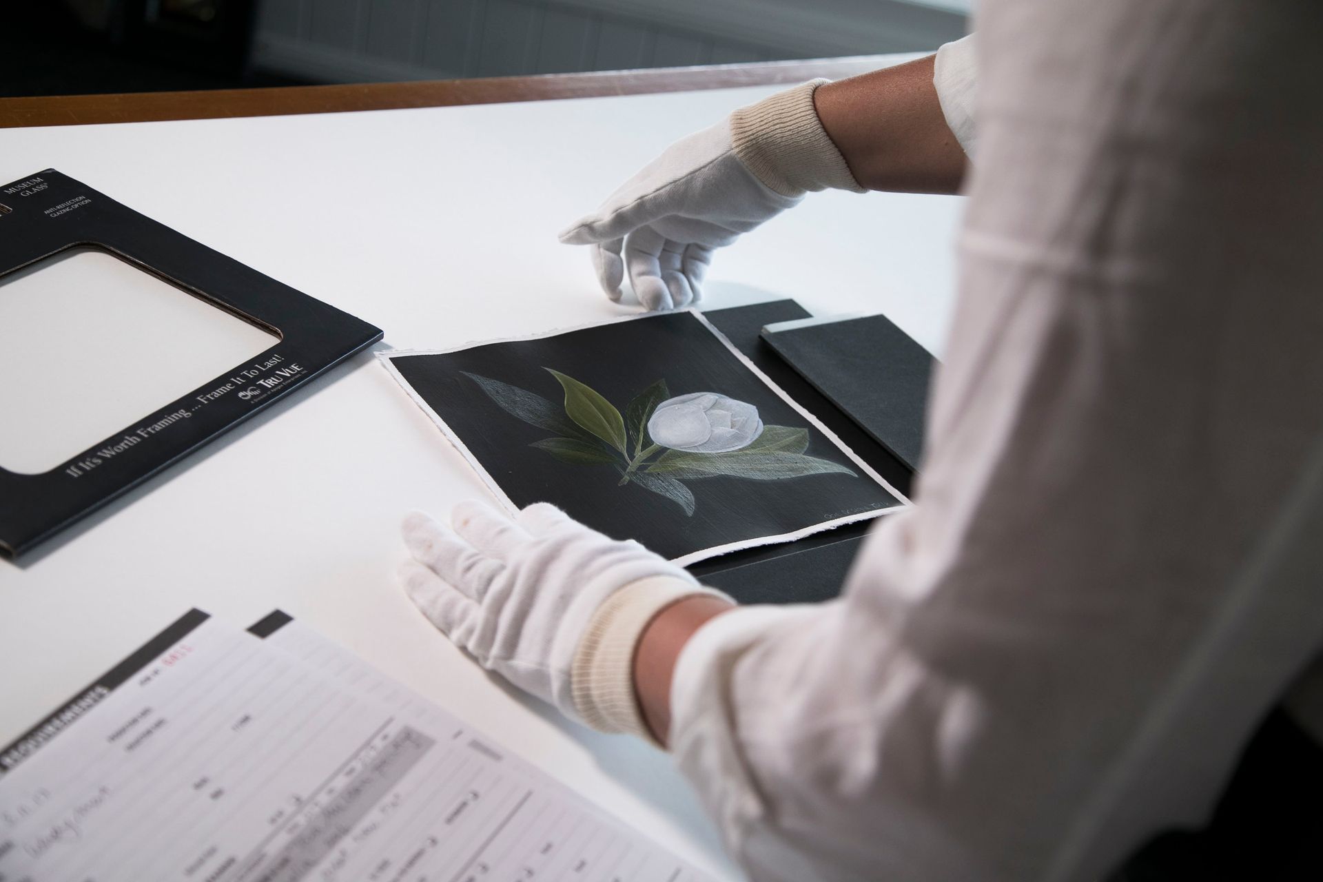
Throughout the process, the illustration was handled with strict conservation protocols — cotton gloves, dust‑free workspace, controlled conditions, and careful observation before final boxing. As Cherylyn puts it, “People do not spend money on framing with anything other than the expectation that the framing activity safeguards their artwork or item to be framed. People are making an investment.”
A shared act of philanthropy for the Toowoomba community
Keelie shared with us what this partnership means to Hogans. "The framing becomes an extension of the piece," she told us, "guiding how it will be viewed, and reinforcing its status as a collectible." For us at ARTSHOP, it's a reminder of why this work matters so deeply: a frame is never a final step to someone else's piece, but part of how that piece will be experienced for years to come — and proof, to us, that thoughtful, custom conservation-standard framing is an art form in its own right.
Designing for LifeFlight carries its own special meaning for Hogans too. "This piece sits as one of our hero creations each year," Keelie explained, "allowing us to showcase both our craftsmanship and technical capabilities."
It’s a sentiment we share at ARTSHOP. Both businesses hold deep respect for the vital work LifeFlight provides to the Darling Downs and the wider community, and contributing through our respective crafts to that cause is a privilege.
Cherylyn notes that this responsibility extends well beyond the annual LifeFlight collaborations. “I estimate that at least 50% of our work at ARTSHOP is correcting the harm caused to artworks that have been irresponsibly framed previously at some point in the life of that artwork.” She approaches those conversations with the same care she brings to the framing work itself: “…we will always provide our clients with full information about the ‘health’ of their artwork, whether treatment is required or not, and provide help and guidance about their options.” It is part of why collaborations like this feel so meaningful — they allow ARTSHOP to show what conservation‑standard framing can achieve when the process is considered from the very beginning.
And now, the moment everyone was waiting for: all those who entered the Balloon Pop helped raise an extraordinary $45,000 toward a new LifeFlight Clive Berghofer Visitor Experience and Education Centre.
We hope the lucky winners, now custodians of these pieces, feel what Keelie describes as an immediate sense of awe — "not only in its beauty and brilliance, but in the craftsmanship and intention behind every detail" — and that ARTSHOP's framing of the illustration plays its own part in that feeling.
We extend our sincere thanks to Keelie for sharing Hogan’s process with us so generously — it has added great depth to our understanding of Fleur de Lune, and to a collaboration that continues to mean a great deal to the team at ARTSHOP.
If you’d like to learn more about our conservation‑grade framing or explore a bespoke presentation for your own artwork or heirloom, our team would be honoured to assist. ARTSHOP Toowoomba specialises in museum‑standard preservation, considered design and the stewardship of pieces that carry meaning for you.
We welcome anyone seeking conservation‑standard framing to visit our Toowoomba studio at 12 Bowen Street, Toowoomba City. Alternatively, you can reach us at framed@artshoptoowoomba.com.au, 07 4639 2771, or via our Contact Us page.